Dynamic Design: Multimedia design ideas for online and remote course creation
Co-writers; Lucy Wolski, is the Instructional Design Specialist for the School of Geographical Sciences and Urban Planning, and her friend and colleague, Mary Loder, is in the role of Instructional Design Specialist at EdPlus at Arizona State University.
Multimedia is your friend

Multimedia is an asset to an online course. A combination of text, images, videos, animations, and audio work together to stimulate the learner’s senses and bring content to life. Not only does multimedia improve the look and feel of a course, but it also fulfills different types of learners’ needs to make learning easier.
A variety of multimedia enhances course design by adding a dynamic combination of content. The Quality Matters Rubric references multimedia design in HE SRS 4.5/K-12 4.4 C, “A variety of instructional materials is used in the course” and HE SRS 6.3, “A variety of technology is used in the course” (Quality Matters, 2019). Most important of all is design standard HE SRS 8.5/K-12 8.5, “Course multimedia facilitates ease of use” (Quality Matters, 2019). The following media are tools for instructors to align with these QM standards for instructional material, technology, and course navigation.
Images
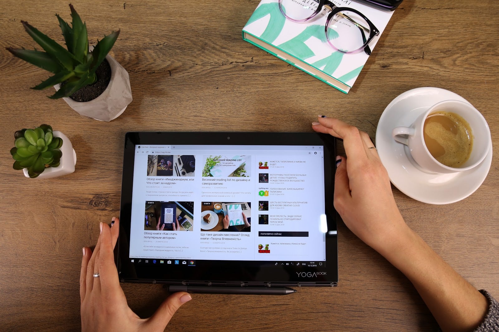
Images, or still images, add information and illustration to course content. The old proverb: a picture is worth a thousand words, shows the effectiveness of using images in education. (Unsplash.com, CreativeCommons.org)

Videos
Videos are commonly used in online courses because of their informational and entertaining nature. Experts from all over the world contribute videos that can usually be shared under the fair use act. (YouTube.com)
Affect and effect | Frequently confused words | Usage | Grammar from Khan Academy. https://youtu.be/5pfZ3dyG1cg
GIFs

GIFs, Graphics Interchange Format, can be instructional or reactionary and are always visually interesting. Usually short, soundless, animations, GIFs make great contributors to student feedback and course content as visuals that convey movement. (Giphy.com)
Memes
Memes are a combination of text and images to convey an idea. Often humorous, they hold a strong message within their borders. Use them to highlight important course policies, or target a desired behavior or action.

Icons and Emojis
Symbols, like icons and emojis, pair with text to easily add a visual punch. They can designate important information, like if the content will be on the test. They can also indicate where and how the student needs to take action. i.e. 📖 Reading, 📝Assignment, ⏳ Quiz, etc. (Emojipedia.org)

Audio
Audio, in the form of podcasts or mp3 files, can work like videos to deliver educational content. Like videos, you can link to content or embed it directly in a course site. And, like videos, audio files should have Closed Captions or transcripts available. (Podbean.com)
Instruction By Design Podcast from https://teachonline.asu.edu/podcasts/
Bitmoji

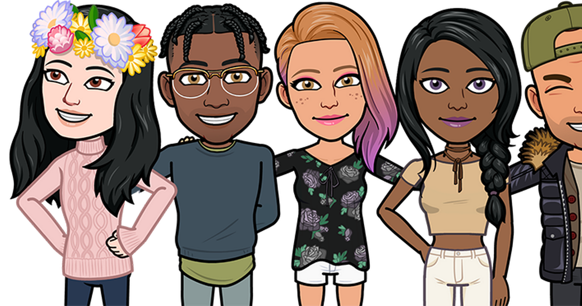
Although not for everyone, a Bitmoji is a customized animated avatar that can be put into course material just like an image. Instead of being a photo likeness, a Bitmoji can be made to demonstrate a variety of expressions and actions. (Bitmoji App)
A bitmoji is a great option for students with privacy concerns who still want to personalize their profile image in your LMS or a course required social engagement site, like Yellowdig or Twitter.
Accessibility
Accessibility is how we include all learners, and therefore a necessary consideration in every course design choice. Visual media like images, GIFs, icons, and bitmojis require an alt text, a text description of the content that can be picked up by screen readers. Some descriptive text does not fit into the restrictive character count of alt text; text alternatives like captions or linked text descriptive documents can be used for longer descriptions. Audio heavy media, like most videos and audio, require closed captions or transcripts. When using multimedia, consider providing alternative formats to ensure everyone can choose the media where they learn best. These accessibility accommodations are necessary for some students, but beneficial to all.
Text, images, and videos are just the surface of multimedia. Experiment with accessible multimedia in your course materials using the content covered above.
References:
Crawford, S. R. (2019). Designing Multimedia Presentations for Your Course. Retrieved from https://www.qualitymatters.org/qa-resources/resource-center/articles-resources/designing-multimedia-for-courses


